Author
Sahil Kumar
Publihsed On
Dec 16, 2025
Updated On
Dec 16, 2025
Category
Bootstrap
Responsive Admin Panel Design Using Bootstrap 4
Hello friends! Today I'm going to show you how to design a fully Responsive Admin Panel using Bootstrap 4 framework and I've used Font awesome library for displaying icons and I've also used some custom CSS properties and a little bit of jQuery.
So, let's open your code editor and just copy the below codes to design this cool Admin Panel.
Step 1:
Create a project directory admin-panel, and then create a file index.html in the root directory. And then just copy and paste the below codes into your index.html file.
<!DOCTYPE html>
<html lang="en">

<head>
  <meta charset="UTF-8">
  <meta name="viewport" content="width=device-width, initial-scale=1.0">
  <title>Admin Panel</title>
  <link rel="stylesheet" href="https://stackpath.bootstrapcdn.com/bootstrap/4.5.0/css/bootstrap.min.css"/>
  <link rel="stylesheet" href="https://cdnjs.cloudflare.com/ajax/libs/font-awesome/5.14.0/css/all.min.css"/>
  <link rel="stylesheet" href="main.css"/>
</head>

<body>
  <div class="main">
    <div class="navbar-side">
      <h6>
        <span class="icon"><i class="fas fa-code"></i></span>
        <span class="link-text">Admin Panel</span>
      </h6>
      <ul>
        <li><a href="#" class="link-active" title="Dashboard">
            <span class="icon"><i class="fas fa-chart-bar"></i></span>
            <span class="link-text">Dashboard</span>
          </a></li>
        <li>
          <a href="#" class="myBtn" data-toggle="collapse" data-target="#my-sub" title="Post" aria-expanded="false">
            <span class="icon"><i class="fas fa-list"></i></span>
            <span class="link-text">Post</span>
            <span class="ml-auto myCaret"></span>
          </a>
          <div id="my-sub" class="collapse bg-secondary">
            <a href="#" title="All Post">
              <span class="icon"><i class="fas fa-copy"></i></span>
              <span class="link-text">All Post</span>
            </a>
            <a href="#" title="Add Post">
              <span class="icon"><i class="fas fa-pen-fancy"></i></span>
              <span class="link-text">Add Post</span>
            </a>
          </div>
        </li>
        <li><a href="#" title="Category">
            <span class="icon"><i class="fas fa-list-alt"></i></span>
            <span class="link-text">Category</span>
          </a></li>
        <li><a href="#" title="Comment">
            <span class="icon"><i class="fas fa-comment"></i></span>
            <span class="link-text">Comment</span>
          </a></li>
        <li><a href="#" title="Tags">
            <span class="icon"><i class="fas fa-tags"></i></span>
            <span class="link-text">Tags</span>
          </a></li>
        <li><a href="#" title="Profile">
            <span class="icon"><i class="fas fa-user-circle"></i></span>
            <span class="link-text">Profile</span>
          </a></li>
        <li><a href="#" title="Setting">
            <span class="icon"><i class="fas fa-cog"></i></span>
            <span class="link-text">Setting</span>
          </a></li>
        <li><a href="#" title="Sign Out">
            <span class="icon"><i class="fas fa-sign-out-alt"></i></span>
            <span class="link-text">Sign Out</span>
          </a></li>
      </ul>
    </div>
    <div class="content">
      <nav class="navbar navbar-dark bg-dark py-1">

        <a href="#" id="navBtn">
          <span id="changeIcon" class="fa fa-bars text-light"></span>
        </a>

        <div class="d-flex">
          <a class="nav-link text-light px-2" href="#"><i class="fas fa-search"></i></a>
          <a class="nav-link text-light px-2" href="#"><i class="fas fa-bell"></i></a>
          <a class="nav-link text-light px-2" href="#"><i class="fas fa-sign-out-alt"></i></a>
        </div>

      </nav>
      <div class="container-fluid">
        <div class="row">

          <div class="col-lg-4 col-md-6 p-2">
            <div class="card border-primary rounded-0">
              <div class="card-header bg-primary rounded-0">
                <h5 class="card-title text-white mb-1">Total Users</h5>
              </div>
              <div class="card-body">
                <h1 class="display-4 font-weight-bold text-primary text-center">105</h1>
              </div>
            </div>
          </div>

          <div class="col-lg-4 col-md-6 p-2">
            <div class="card border-success rounded-0">
              <div class="card-header bg-success rounded-0">
                <h5 class="card-title text-white mb-1">Verified Users</h5>
              </div>
              <div class="card-body">
                <h1 class="display-4 font-weight-bold text-success text-center">75</h1>
              </div>
            </div>
          </div>

          <div class="col-lg-4 p-2">
            <div class="card border-danger rounded-0">
              <div class="card-header bg-danger rounded-0">
                <h5 class="card-title text-white mb-1">Unverified Users</h5>
              </div>
              <div class="card-body">
                <h1 class="display-4 font-weight-bold text-danger text-center">30</h1>
              </div>
            </div>
          </div>

        </div>

        <div class="row">

          <div class="col-lg-4 col-md-6 p-2">
            <div class="card border-primary rounded-0">
              <div class="card-header bg-primary rounded-0">
                <h5 class="card-title text-white mb-1">Total Posts</h5>
              </div>
              <div class="card-body">
                <h1 class="display-4 font-weight-bold text-primary text-center">98</h1>
              </div>
            </div>
          </div>

          <div class="col-lg-4 col-md-6 p-2">
            <div class="card border-success rounded-0">
              <div class="card-header bg-success rounded-0">
                <h5 class="card-title text-white mb-1">Published Posts</h5>
              </div>
              <div class="card-body">
                <h1 class="display-4 font-weight-bold text-success text-center">33</h1>
              </div>
            </div>
          </div>

          <div class="col-lg-4 p-2">
            <div class="card border-danger rounded-0">
              <div class="card-header bg-danger rounded-0">
                <h5 class="card-title text-white mb-1">Private Posts</h5>
              </div>
              <div class="card-body">
                <h1 class="display-4 font-weight-bold text-danger text-center">16</h1>
              </div>
            </div>
          </div>

        </div>

        <div class="row">
          <div class="col-lg-6 p-2">
            <div class="jumbotron rounded-0">
              <h1 class="display-4">Hello World</h1>
              <p class="lead">Lorem ipsum dolor, sit amet consectetur adipisicing elit. Repudiandae, recusandae maiores
              </p>
              <hr class="my-4">
              <p>Lorem ipsum dolor sit amet consectetur adipisicing elit. Delectus, voluptatem ea similique ratione vero
                mollitia accusantium! Eius amet minus dolorum sint odio ut ipsam temporibus necessitatibus blanditiis
                quidem, iusto doloremque!</p>
              <a href="#" class="btn btn-primary btn-lg rounded-0">Learn More</a>
            </div>
          </div>
        </div>
      </div>
    </div>
    <script src="https://cdnjs.cloudflare.com/ajax/libs/jquery/3.5.1/jquery.min.js"></script>
    <script src="https://cdn.jsdelivr.net/npm/popper.js@1.16.0/dist/umd/popper.min.js"></script>
    <script src="https://stackpath.bootstrapcdn.com/bootstrap/4.5.0/js/bootstrap.min.js"></script>
    <script src="script.js"></script>
</body>

</html>
Step 2:
Okay now in this step We'll create a custom CSS file to give some custom styling and making fully responsive. So for this just create a new file "main.css" in the root directory and copy the below code and paste it in the "main.css" file and save.
* {
  margin: 0;
  padding: 0;
  -webkit-box-sizing: border-box;
  box-sizing: border-box;
}

body {
  font-family: "Segoe UI", Tahoma, Geneva, Verdana, sans-serif;
}

.navbar-side {
  width: 200px;
  height: 100vh;
  position: fixed;
  background-color: #343a40;
  -webkit-transition: 0.2s all ease-in-out;
  transition: 0.2s all ease-in-out;
}

.navbar-side h6 {
  color: #fff;
  margin: 9px 0 10px 20px;
  font-size: 18px;
  line-height: 1.6;
  white-space: nowrap;
}

.navbar-side ul li {
  list-style-type: none;
}

.navbar-side ul li a {
  padding: 10px;
  display: inline-block;
  text-decoration: none;
  color: #ccc;
  font-size: 1.1em;
  width: 100%;
  padding-left: 20px;
  -webkit-transition: 0.2s all ease-in-out;
  transition: 0.2s all ease-in-out;
  white-space: nowrap;
}

.navbar-side ul li a:hover,
.navbar-side ul li a.link-active {
  background-color: #212121;
  border-left: 5px solid #ccc;
}

.navbar-side ul li a .icon {
  padding-right: 10px;
}

.content {
  margin-left: 200px;
  -webkit-transition: 0.2s all ease-in-out;
  transition: 0.2s all ease-in-out;
}

.content #navBtn {
  font-size: 20px;
}

.main.animate .navbar-side {
  width: 60px;
  -webkit-transition: 0.2s all ease-in-out;
  transition: 0.2s all ease-in-out;
}

.main.animate .navbar-side .link-text {
  display: none;
}

.main.animate .navbar-side .myCaret {
  display: none;
}

.main.animate .content {
  margin-left: 60px;
}

.myBtn[aria-expanded="false"] .myCaret:before {
  font-family: "Font Awesome 5 Free";
  font-weight: 900;
  content: "f107";
  float: right;
  transition: all 0.5s;
}

.myBtn[aria-expanded="true"] .myCaret:before {
  font-family: "Font Awesome 5 Free";
  font-weight: 900;
  content: "f107";
  float: right;
  transition: all 0.5s;
  -webkit-transform: rotate(180deg);
  -moz-transform: rotate(180deg);
  transform: rotate(180deg);
}

@media (max-width: 991px) {
  .main .navbar-side {
    width: 40px;
    -webkit-transition: 0.2s all ease-in-out;
    transition: 0.2s all ease-in-out;
    font-size: 0.8em;
  }
  .main .navbar-side .link-text {
    display: none;
  }
  .main .navbar-side .caret {
    display: none;
  }
  .main .navbar-side h6 {
    margin: 9px 0 10px 9px;
    font-size: 1.2em;
    line-height: 1.9;
  }
  .main .navbar-side ul li a {
    padding-left: 10px;
  }
  .main .navbar-side ul li a:hover,
  .main .navbar-side ul li a.link-active {
    border-left: 2px solid #ccc;
  }
  .main .content {
    margin-left: 40px;
  }
  .main.animate .navbar-side {
    width: 150px;
    -webkit-transition: 0.2s all ease-in-out;
    transition: 0.2s all ease-in-out;
  }
  .main.animate .navbar-side .link-text {
    display: inline-block;
  }
  .main.animate .navbar-side .caret {
    display: block;
  }
  .main.animate .content {
    margin-left: 150px;
  }
  .myCaret {
    display: none;
  }
}
Step 3:
Now, this is the final step in which We'll write some jQuery code to make the hamburger menu working to hide and show the side navbar. So for this just create another file "script.js" in the root directory and copy the below code and paste in the "script.js" file and save.
$(document).ready(function() {
$("#navBtn").click(function() {
$(".main").toggleClass('animate');
});
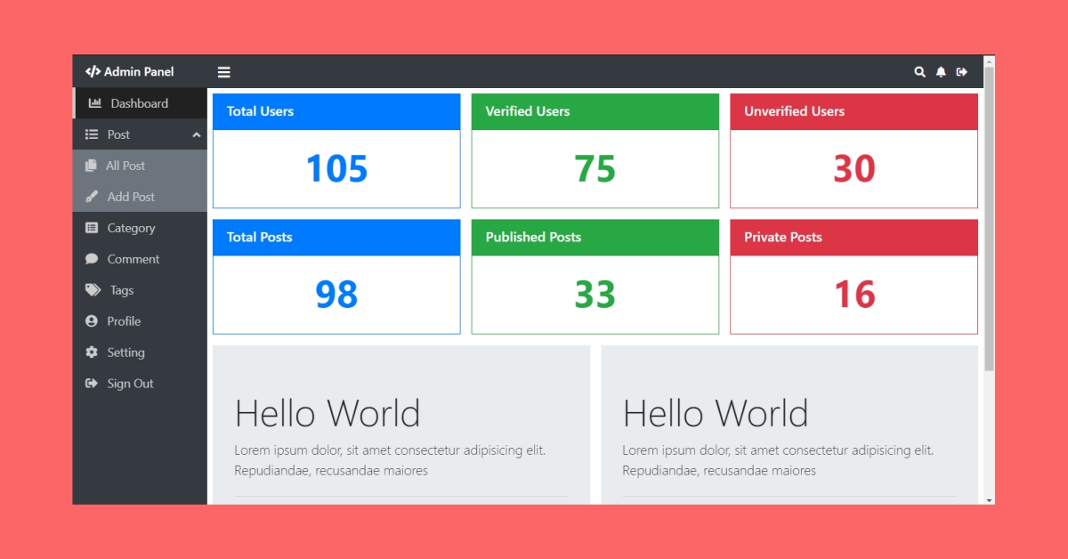
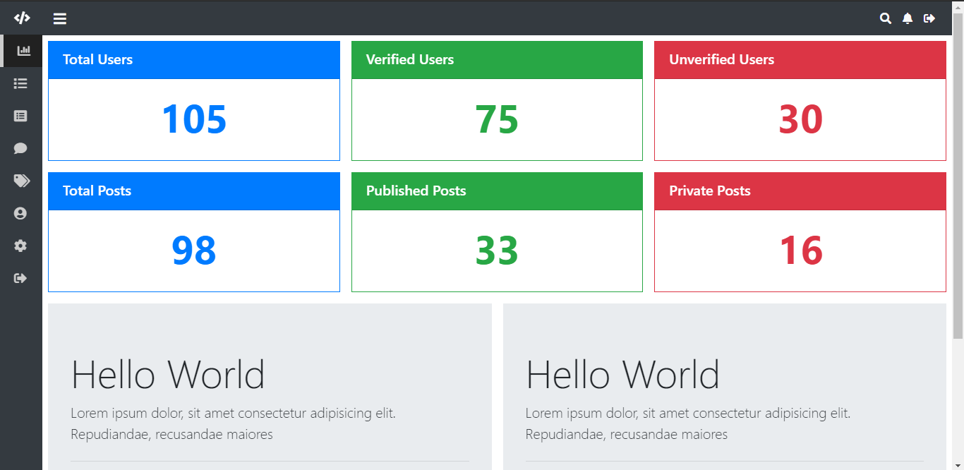
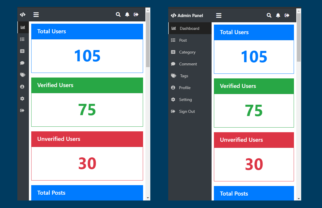
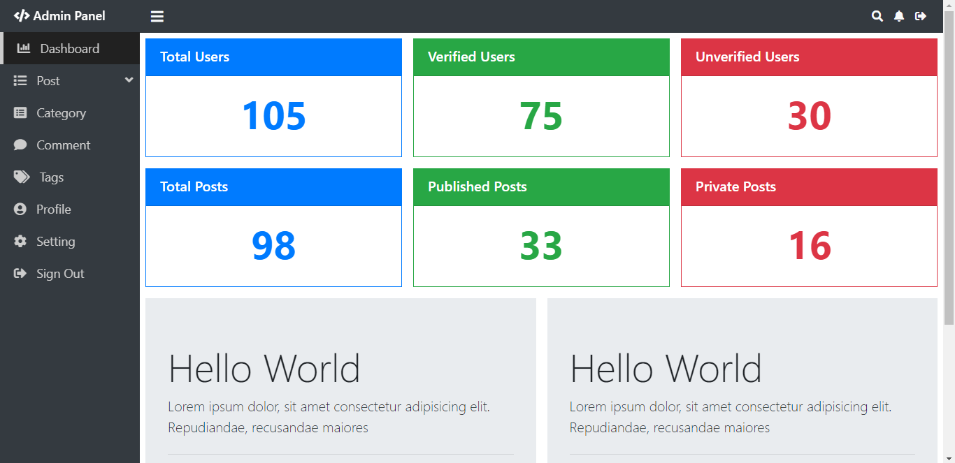
});Now our Admin Panel is ready just open your index.html file in the browser to see the output. Here are some sample outputs of the Admin Panel.

Sahil Kumar
Full Stack Web Developer
Hello! I'm a part-time blogger & YouTuber living in India. This is my personal blog where I write Web Design & Development tutorial posts!
Know more about me
SUBMIT GUEST POST 🚀
Ready to contribute? Head to the article dashboard to publish your own insightful articles and share them with our audience!
Go to dashboardRECENT POSTS

How Digital Marketing Drives Growth in eCommerce Businesses
7 months ago

Building a Secure Authentication System with PHP OOP, PDO, MySQL, and Bootstrap 5
7 months ago

10 Essential Web Design Principles for Creating a User-Friendly Website
7 months ago

Send Mail with Contact Form Using PHPMailer & Gmail SMTP | 2023
7 months ago
Full Stack Laravel 10 & React JS | SPA Authentication | Part 2
7 months ago